Case Study - Glasshouse Florist App
A flower catalogue app for a trendy florist making its move to the online realm. It’s main objective is to create a platform that bridges the limitations of traditional offline flower shopping.
UX/UI Design | B2C Mobile Application | iOS Compatibility
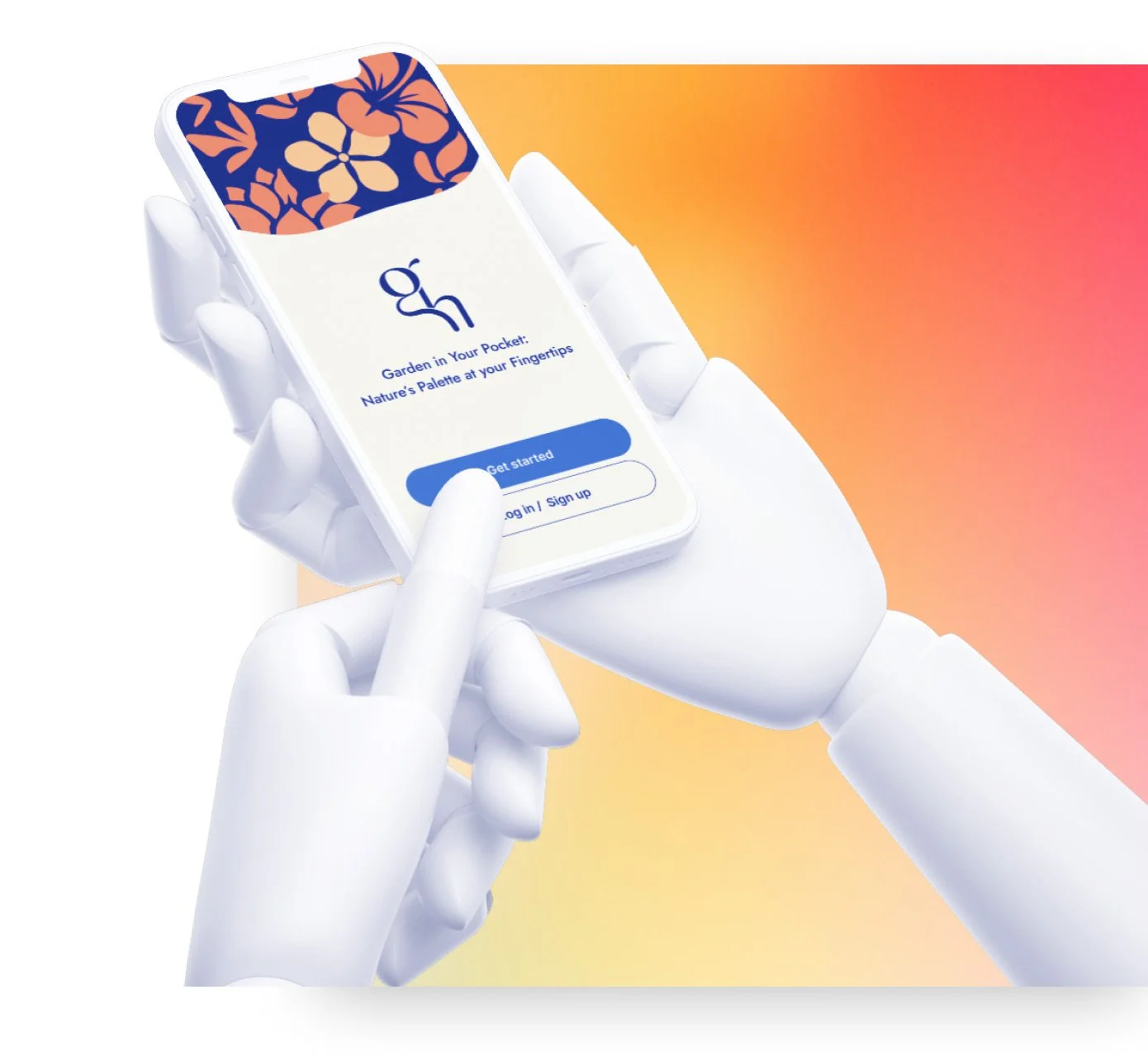
Garden in Your Pocket:
Nature’s Palette at Your Fingertips
The project aims to create an online flower catalogue app for a trendy florist, providing users with convenient shopping options, precise delivery services, and comprehensive flower guides that encompass detailed care instructions and flowers’ symbolic meanings.
Concept Development
Wireframes
User Experience
User Interface
Brand Visual Design
Deliverables
Key Softwares
Figma
Adobe Illustrator
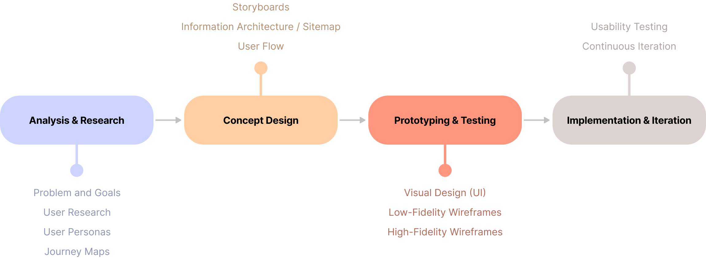
01. Design Process
02. Problem and Goals
Interviews was conducted on multiple individuals with varying locations around London to figure out their pain points. Primary user groups were young adults in the beginning of their career and busy middle-aged professionals – all living close or in city central with reliable access to delivery services.
03. User Research
“Initial assumptions suggested that people hesitated to embrace technology due to concerns about losing personalised in-person services. However, research showed that users prioritise efficient online services that save time and offer the convenience of shopping for flowers at their leisure.”
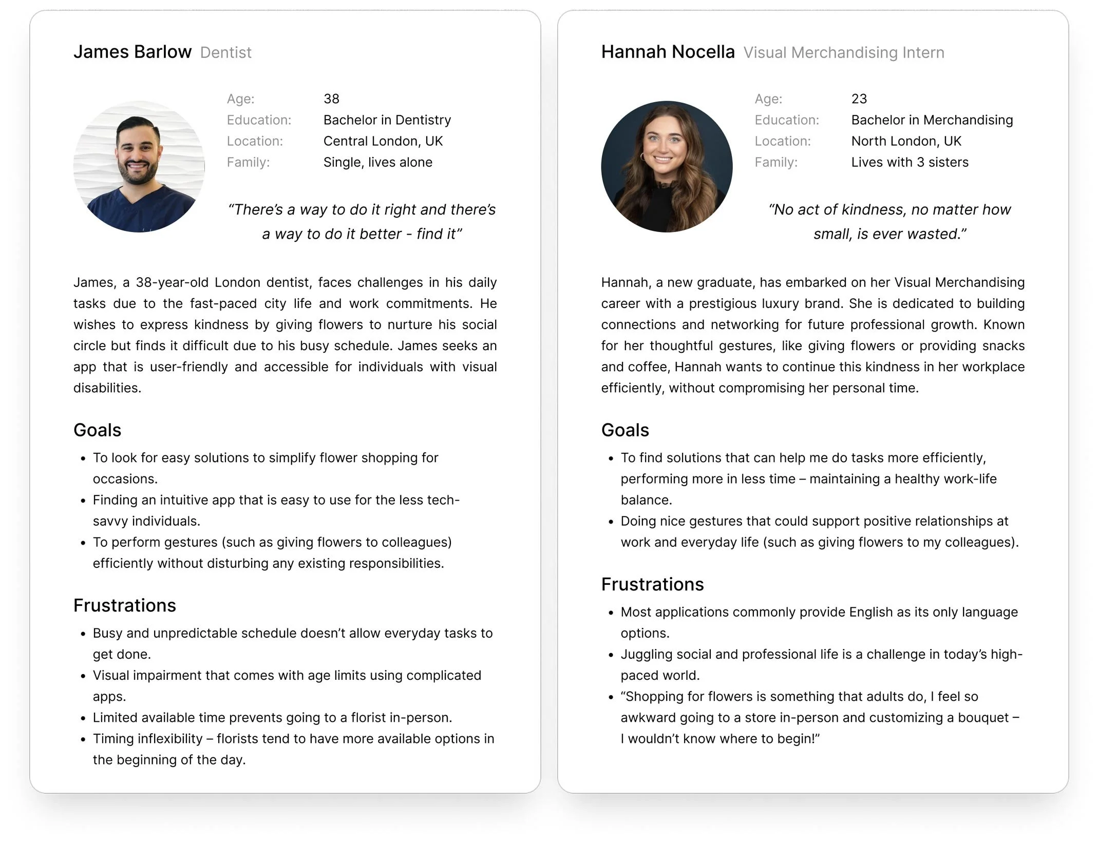
04. User Personas & Storyboards
05. Journey Maps
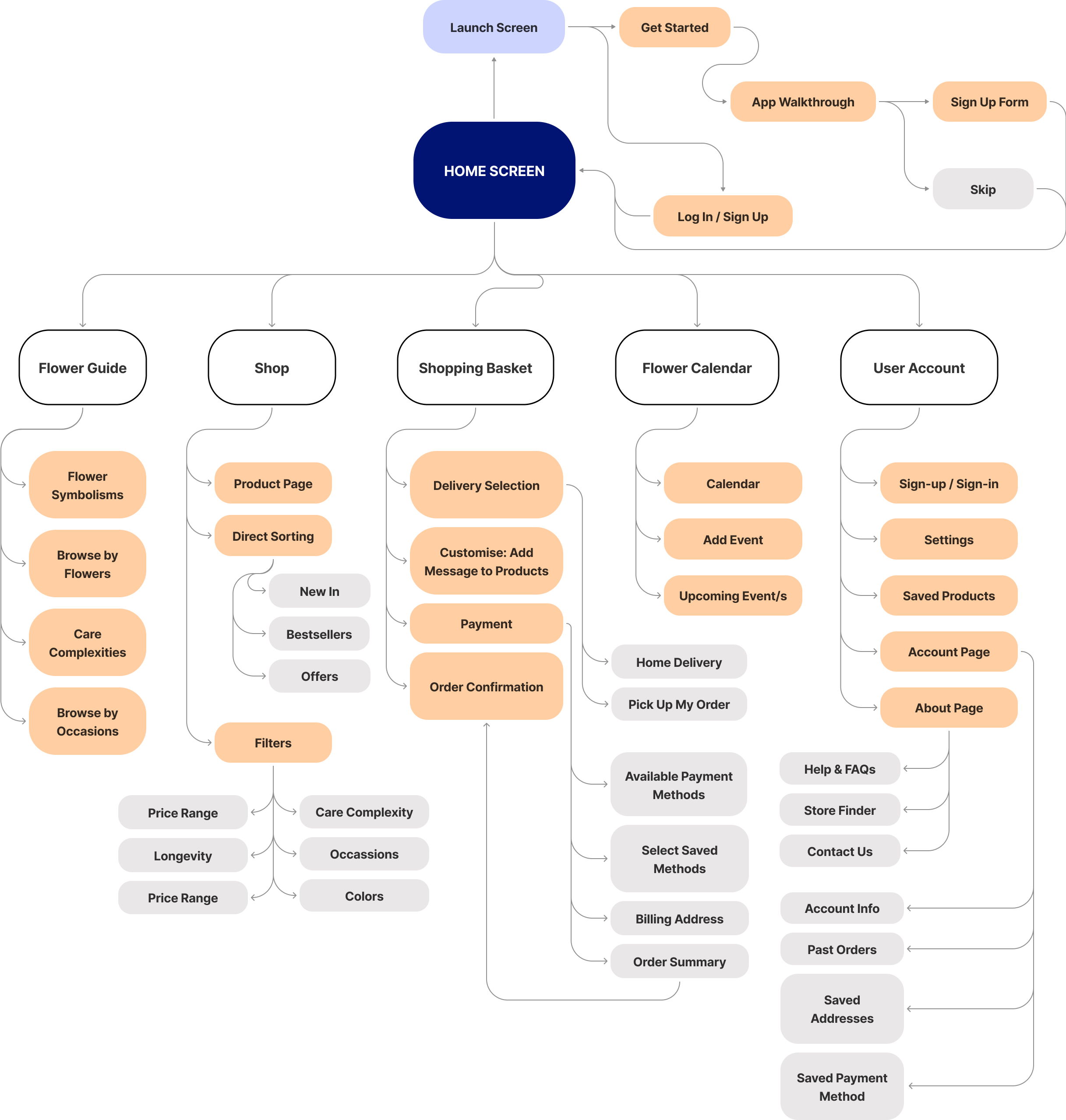
06. Information Architecture (IA) / Site Map
Thorough planning is conducted to establish a well-structured application, with the aim of delivering a streamlined and intuitive platform.
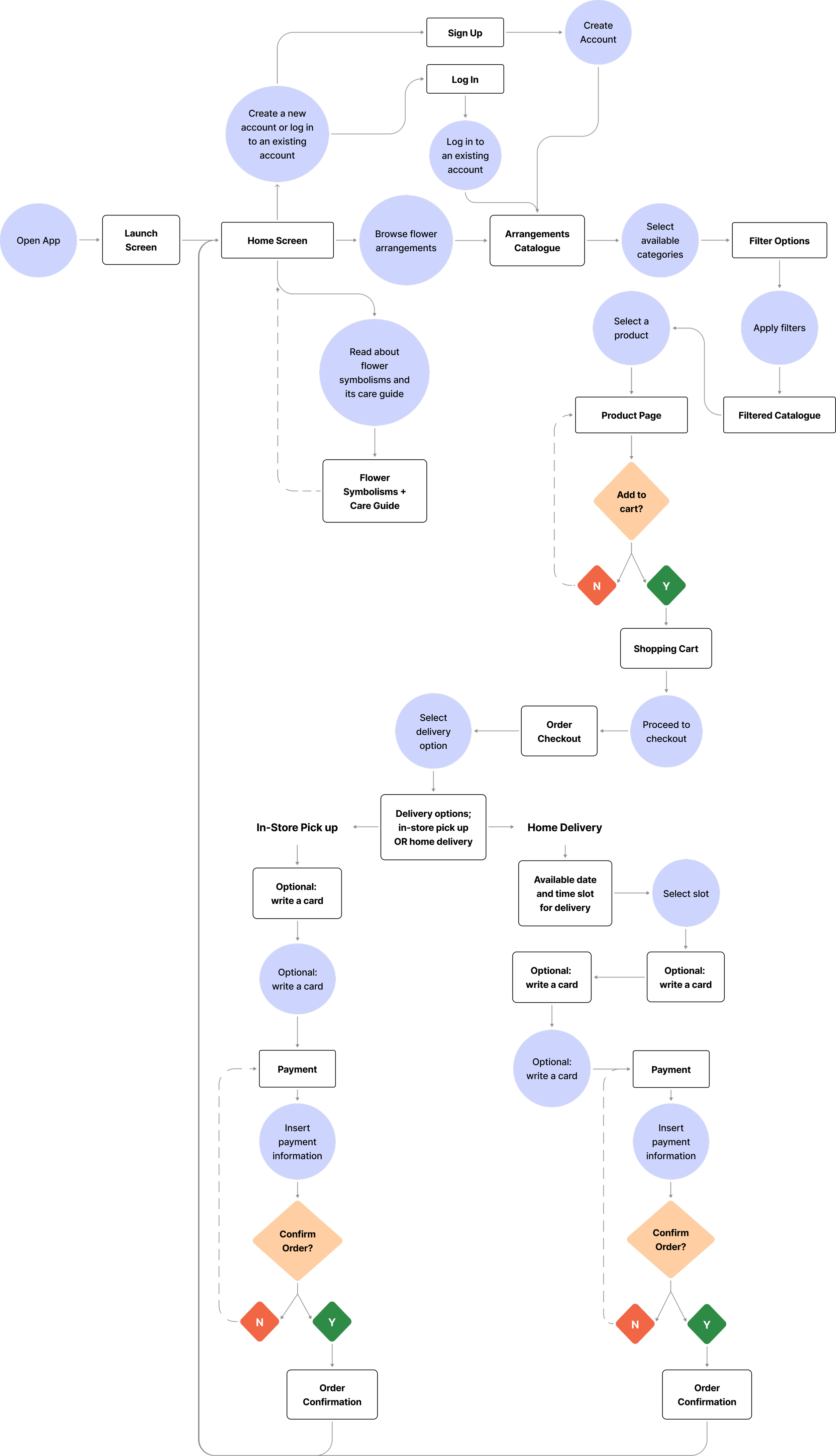
Predicted the possible user journey through the app that would take place to reach the ultimate goal of order placement.
07. User Flow
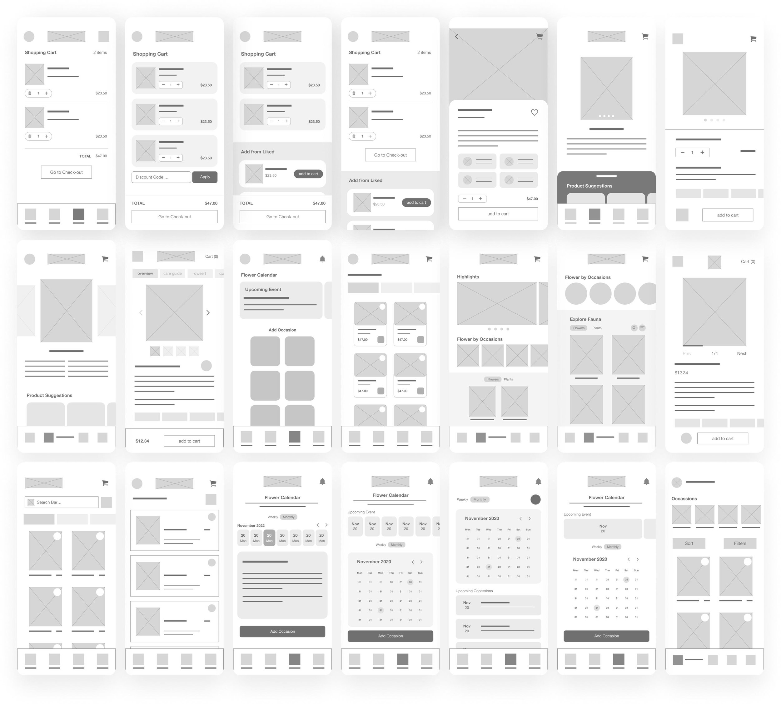
Explored numerous approaches to create visually appealing and user-friendly key pages that prioritise intuitiveness and practicality.
08. Low Fidelity Wireframes
09. Visual Design
Colors were directly inspired by nature's own palette, utilizing vibrant hues to actively engage users.
01/ Colour
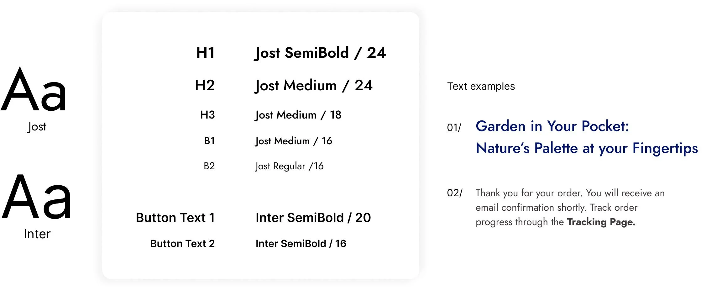
02/ Typography
Texts throughout the app is kept simple to maintain visual accessibility.
The logo was designed to be sleek and minimalist, featuring rounded corners that evoke a sense of softness. This aesthetic choice aligns with the elements found throughout the app, including action buttons.
04/ Logo
The graphics were derived from various flowers indigenous to different regions in Asia. Instead of emphasizing intricate details, silhouettes were used to align with the brand's logo.
05/ Flower Graphics
10. High Fidelity Wireframes
Launch screen that takes returning users to log in and new users through the walkthrough steps. It explains app’s features, benefits, and Glasshouse’s unique selling point.
01/ Onboarding & Walkthrough
Minimally designed Shop and Product page to maintain user’s focus.
02/Homepage & Product
In-depth guides into the world of flowers, enabling users to shop with intention.
03/ Flower Guide
Effortlessly review and modify items added to the basket with intuitive controls.
04/ Shopping Basket
Users are able to pick their preferred way of accepting their order. Glasshouse offers specific date and time slots to ensure customers get their flowers on time.
05/ Checkout - Delivery
Glasshouse users have a wide selection of payment methods to choose from or conveniently sort through saved payment methods with just a few clicks.
06/ Checkout - Payment
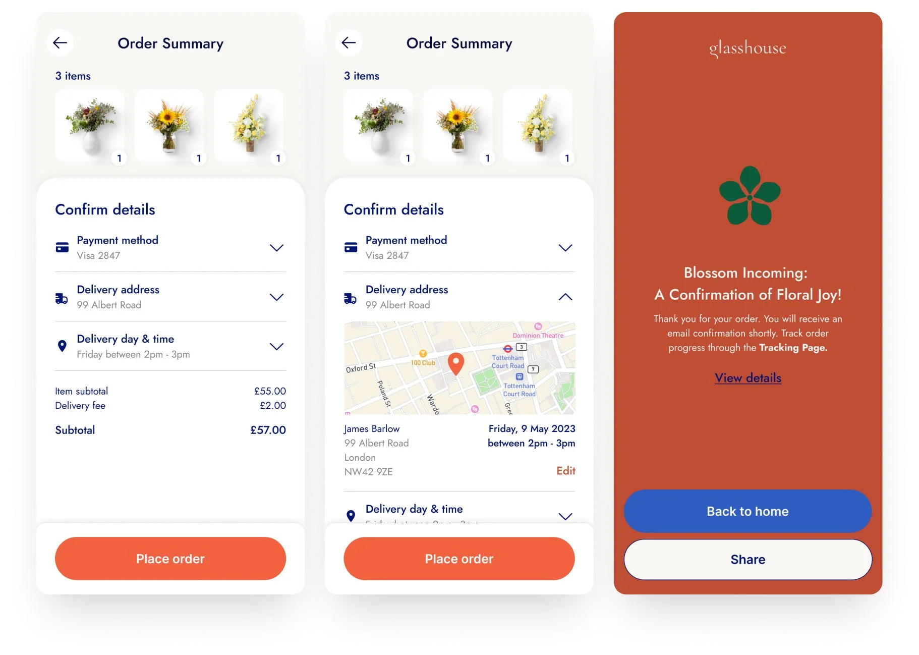
Review the order once more prior to confirmation to ensure the accuracy of the details.
07/ Order Summary & Confirmation
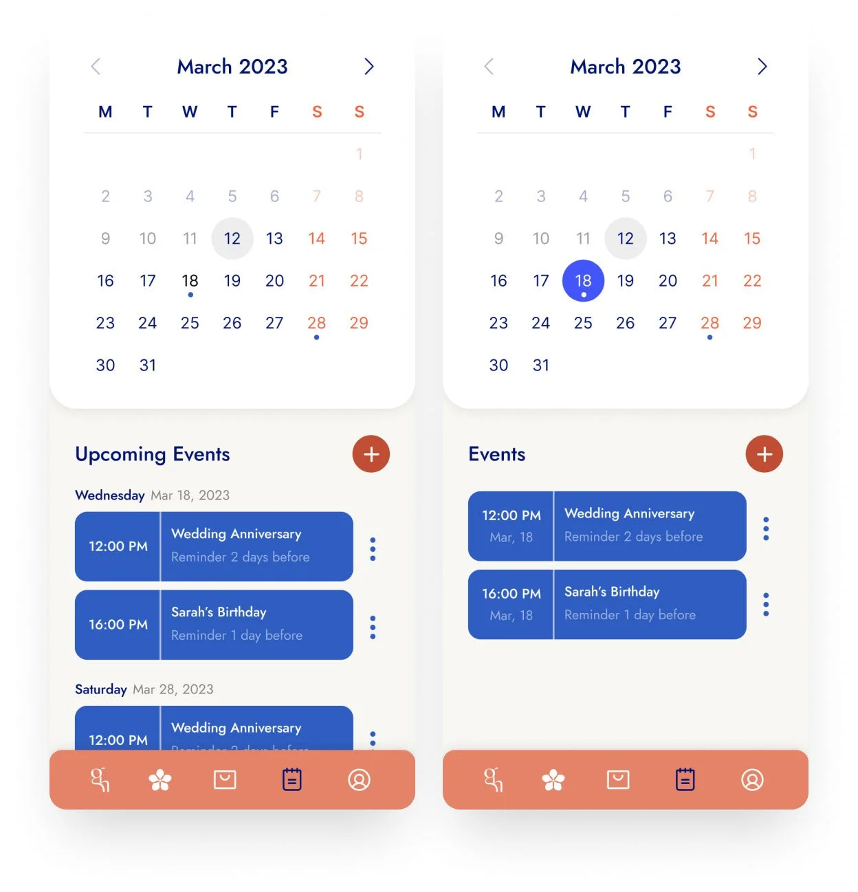
Bid farewell to last-minute flower shopping with Glasshouse's Flower Calendar, ensuring you never have to scramble again.
08/ Flower Calendar
11. Future Iteration
Product Recommendations
Incorporate product recommendations in each pages of flower guide. It will create an integrated hassle-free shopping experience
Dark Mode
Implementing a dark mode feature to ensure comfortable app usage during nighttime and to accommodate users with visual disabilities.
Pre-Order Ahead of Time
Allow customers to order products ahead of time through the Flower Calendar to avoid last-minute mishaps
